Paper 2 - Design
Brainstorm:
For Paper 2 I have chosen Textile design and I have decided to create a collage, I chose a collage because i wanted to use florals as a main part of my project. I had thought of making a dress in the initial thinking stage but then I had already attempted to make a dress in my old school and it had taken a rather longtime and also the end product was not as good as i hoped it would be, it was a hard and tedious process. I have chosen to do opposites in the theme of flowers, so one side will be funky and retro flowers while the other side is going to be more classic. I was thinking of using scrap fabric and newspaper to build the main base of the flower and then later on stitch onto it. The dotted lines on the drawing below represent the stitch lines and the colour shows what colour thread i will be using.

Inspiration:
Cartoon Vs Classic
Cartoon


Classic


Theme:
For my theme i have decided for this project is opposite's, and it is based around florals, so i have chosen to do cartoon vs classic flowers. as the modern and old-fashioned flowers have different structures, they also both in contrast with each other.
Artist Research:
The two artist i am using for my inspiration is Cath Kidston and Georgia O'keeffe.
Cath Kidston:

Catherine Isabel Audrey kidston or more commonly known as cath kidston is an English fashion designer, business woman and author. Cath kidston was born on 6th November 1958 in andover in Hampshire.
Cath kidston is most famous for her floral prints, cath kidston was raised with three other siblings, she was educated at a number of UK boarding schools before she moved to london at the age of 18. Cath kidston opened her first shop in london Notting hill in 1993. Where she sold hand embroidered tea towels and brightly renovated furniture.
Why I like her work?
I like her work because he layout is really simple and repetitive but its still effective and her choice of colour really suits the types of flowers she uses.
Why i chose her work?
The reason i chose cath kidston for my work is because it fits in in with my themes, opposites. Cath kidston makes cartoon like print, however he print is always repetitive which can be quite effective at times so i might also use this technique. I also chose her because i like her print and the colour she chooses compliments the background.
Georgia O'keeffe:

Georgia O'keeffe was an American artist. She was born near sun Prairie, Wisconsin. Her artwork was first recognised in New York 1916. Georgia O'keeffe had a unique idea of enlarging the flower and then interpreting it in her own way. When Georgia O'keeffe was doing these paintings she used bright colours. Also many of her paintings are closeups of a single blossom as she was very much into showing her viewers what her flowers looked like.
Georgia O'keeffe's work is very bright and colourful which makes it very lively and also more interesting to look at. I like the way she has a very different approach to flowers, because rather than looking at the flower as a whole, she decides to focus on enlarging the flower and looking at the centre. From some of her paintings, i can see that she paints a of flowers and doesn't just stick to one type of flower. This makes sure her paintings are not repetitive otherwise it tends to become boring. I also like her paintings because they are vibrant and colourful, and paintings such as this make me feel happy and confident about using the painting for my work.
Why chose her work?
I chose Georgia O'keeffe as one of main artists because i like the her flowers structured and she makes good use of the tone and colour on the flower. Though the structure of her flowers may look complex and detailed, when i tried sketching it for my final piece i realised that
Why i like her work?
I like Georgia O'keeffe's work because it is very delicate and the choice of colours and contrast is very well thought out it also suits her style of work, because she generally tends to choose flowers and then zoom into them so she can get the intricate detail of the flower which makes it more interesting to look at. Georgia O'keeffe also inspects the change in tone of the colour, she then shows this in her work and therefore makes it look more effective.
Media Experimentation:
So for my media experimentation I was thinking of using scrap pieces of fabric as the main base of the flower but then later I realised that it wont be that easy because each piece of scrap fabric will have to be individually sowed together and that would take a longtime, also the art studio doesn't provide any of the essential equipment so i decided not to use that idea, due to the fact it would just take to long.
Instead I chose newspaper for the base of the flower, first i took several sheets of newspaper and scrunched them up together to create a small paper ball, after this i celotaped parts of the paper ball just to secure it in place. Later on i took another sheet of newspaper and made it into a smaller ball and attached it to the larger paper ball using celotape. I then had to repeat this step several times till it looked somewhat like a flower. I then needed thread which i could sew through the newspaper with, I decided that if i used thread it wouldn't be particularly prominent and this was the main purpose of the thread so instead i used wool. The colour of the wool was white and i didn't want that colour so i had to dye the thread a different colour.
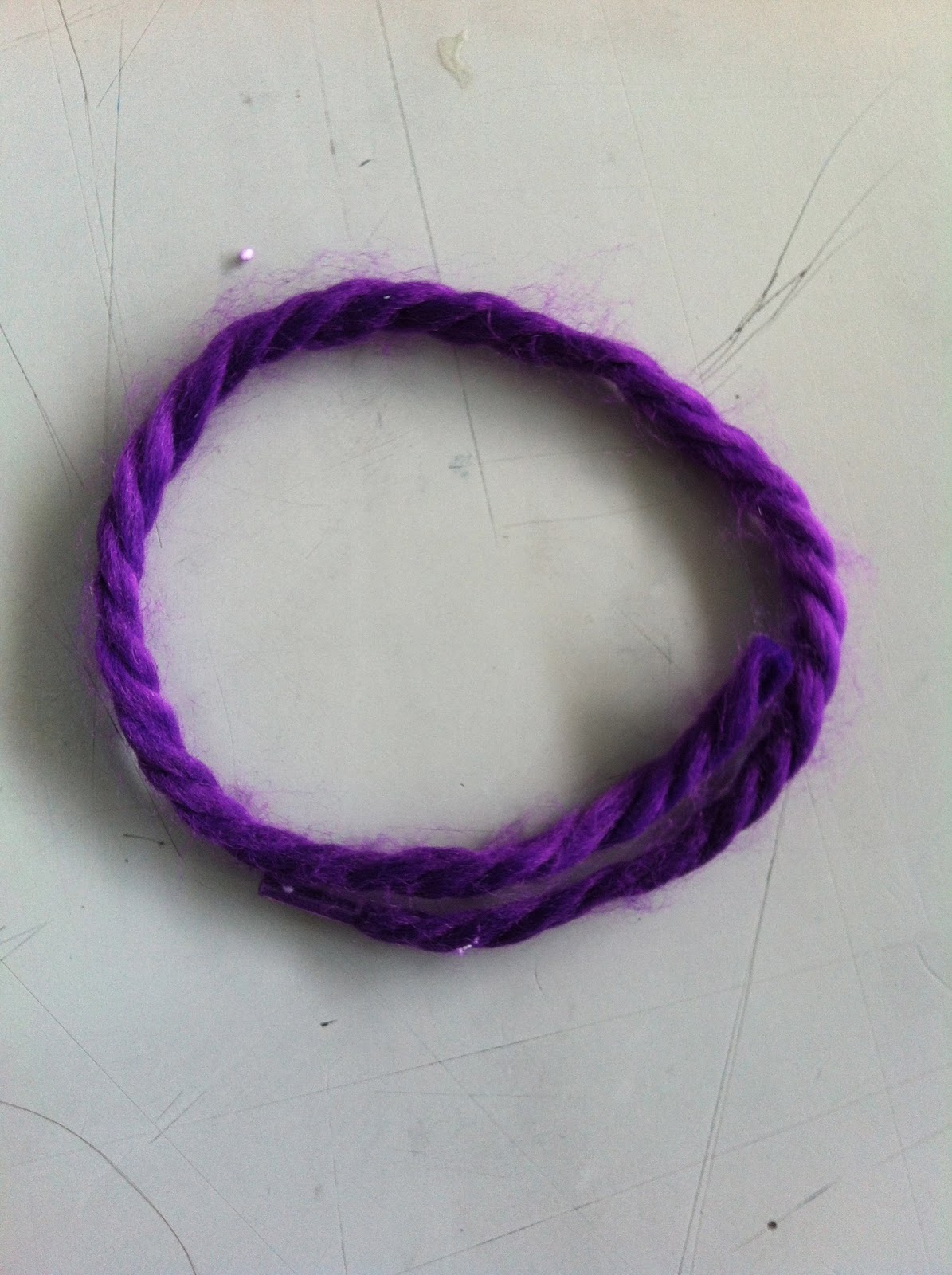
Dying the thread:
First of all i cut the wool to the length i acquired and then placed it into a beaker and added purple water colour concentration into it, i filled it till i could no longer see the wool and then i waited for 2 minutes to let the colour absorb into the wool.

Then i lifted the wool out of the concentration and squeezed out the excess colour, there was a lot of excess concentration left in the beaker so i poured that back into the bottle. Afterwards, I dabbed off the wet watercolour concentration off the wool because it would affect the material which I was going to use as a base, later i started cutting slits in the newspaper around the edge of the flower and around the edge circle

I had to use the pen knife because this was the most efficient tool to make cuts in the newspaper I then started threading in the purple coloured wool.


This was when I encountered my first problem and this was that it was very hard to thread the wool through the newspaper because the wool was very flimsy and i found it hard to push the wool through so this was when i came up with my idea of wounding celotape around one end of the wool to make it firmer and therefore easier to thread through the newspaper.
But while I was doing this i saw that the colour of the wool was getting absorbed into the newspaper making it soggy and also making it ripped. This was when i had to re-think my plan. So rather than using newspaper i decided on using card paper,
My process:
So i started by drawing a flower inspired by Cath Kidston, it was a cartoon style, this was because one side was going to cartoon and the other side was going to be classic. I still used the same purple dyed wool as shown below. I then made slits in the paper and afterwards i threaded it through, and gave the flower an outline using a black marker. This was my first flower complete.

I then started on my second flower which was going to have a slightly different layout, rather than having the petals rounded this flower was going to have pointed petals, but still have that retro look.


I then then went over it with coloured markers. Then repeated the process of cutting slits into the flower and leaving an equal space between each one, to give it a neater finish. In the third picture I have dyed two pieces of wool one after another because i realised my fingers turned purple during my media experimentations so i decided if i dye the wool at the same time i could get it over and done with in one shot. But I will be using the yellow wool for this flower as the centre of this flower is already red and this would clash with the red wool.

This is showing the stitching through the card paper. Before i started i needed to tie a knot at one end of the string to make sure it would be secure.


This just shows the slits which i created zoomed in. I cut out leaves to put around the leaves and went over the outline in dark green. I just chose to do the outline because it looked more effective this way and also it wouldn't waste the ink.

This is the third and final retro/cartoon flower. The third flower pattern is also based on one of cath kidston's designs, I have used the solid circle which is in yellow and the small red dots these are two contrasting colours which makes both of them stand out against the dotted turquoise blue. The crimson is bright and eye catching which is why i chose this colour. Unfortunately the wool ended up on the top so i had to celotape it and now it doesn't look as professional but i wouldn't have been able to change that anyway because thats how the wool ended up. But since the tape is transparent it doesn't really make that much of a difference.


This is one of my classic flowers which i drew, I looked at Georgia O'keeffe and i sort of adapted my style because when i tried drawing one of the detailed intricate flowers it didn't turn out very well and i didn't want to ruin my whole board just because i couldn't draw one flower so i drew a simplified version, i did the same thing for the flower below.


This flower is more inspired by a sunflower, although Georgia O'keeffe hasn't drawn any sunflower's i still thought this would be regarded as a classic flower and so went ahead with the plan.

This is a zig-zag pattern which is going across the board and either side has a line going on either side of it and I decided to colour it black because it was a bold colour which would clearly point out the difference between the cartoon and the classic flowers


This is the other side of all the flowers showing that I used PVA glue to stick it onto the card.
My Final Piece:

This is my Final piece Completed. I added the string to it for an effect and it also meant that my classic section wasnt left blank or empty.


